by Forbury Lion »
06 Jan 2021 11:02
Reading4eva All the uproar across Everton & Port Vale about changing there club crests has got me thinking. Everton said their old crest was badly represented on TV, tablets and in computer games. It was also difficult to replicate, which led to a change. The Everton fans are not fans of this of course, and have already kicked off as reported in newspapers.
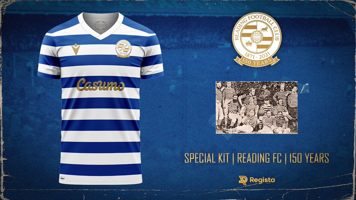
Their CEO has a point though, and it led to me thinking about Reading's crest. The wording is hard to see when the image is too small. Also the lion and the crown are difficult to see.
How about making a shield (in respect to our old crests), with a blue and white hooped background with Reading at the top and 1871 at the bottom, with a lion with a ball at its feet and crown on its head in the middle. Would be more of a brand than our current logo? Discuss!
I recall the reasons for switching to the current crest were pretty similar to those given by Everton above, plus working better on merchandise as a round logo.
You don't have to read the wording on a logo to recognise the logo.
I do get annoyed with things like away shirts that change the logo colour to the colour of the print rather than have the actual colour logo sewn on.